Everything needed to write, design, and build with Termbay
consistently — the story behind the harbor metaphor, the full
color and type system, logo construction and misuse rules, the
Buoy mascot, illustration style, and downloadable source files.
Brand story & positioning
A coding agent CLI is a boat — it goes out, does work, comes back
with something to report. Run several at once and you need a
place to dock them where you can see all of them at a glance,
without losing track of which one needs you. That place is the
bay.
Every terminal column in Termbay is a docked vessel: given its own
berth, resizable, movable between rows, but never lost in a sea
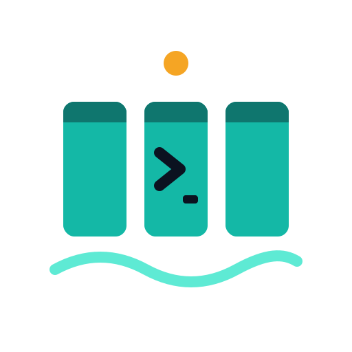
of tabs. The beacon — the amber dot at the top of
the mark — is the thing that calls your attention across the
whole harbor: an agent waiting on you, a finding that needs a
decision, a run that just finished. The water line
underneath is the tide: agents working, always some quiet motion
even when nothing demands your attention yet.
Mission
Make running many AI coding agents at once feel like commanding a
small, orderly harbor instead of wrangling a pile of terminal
tabs — provider-agnostic, transparent about what each agent can
and can't do, and honest when it doesn't know something (a cost
number, a context window) rather than guessing.
Audience
Developers already running more than one coding-agent CLI, or
curious to — people comfortable in a terminal, who want real
control (permission modes, worktree isolation, headless runs)
rather than a simplified chat wrapper.
Personality & values
Orderly, not sterile. A harbor has structure — berths, a beacon, a tide — but it's alive, not a spreadsheet.
Provider-agnostic. No CLI is the hero; Termbay never plays favorites in copy, iconography, or default sort order.
Honest about uncertainty. "Not available" beats a fabricated number. Uncertain capabilities are labeled, not hidden.
Quietly capable. Confidence without hype — the product argues for itself through what it actually does.
Voice & tone
Termbay's voice is direct, technically precise, and dry rather
than exclamatory. It talks to developers like a competent
colleague — never a hype machine, never cute at the expense of
clarity.
Do
"Claude Code's 5h/weekly windows are estimated — no real rate-limit API exists."
"Kill the column, or resume it later — the session id stays valid."
"This adapter doesn't expose cost data. We show that honestly instead of guessing."
Don't
"Supercharge your workflow with AI-powered productivity!"
"Oops! Something went wonky 🙈" (never fabricate cheerfulness around an error)
"Termbay just knows what you need." (it doesn't guess — it reports)
Microcopy rules
Buttons are verbs: "Spawn", "Kill", "Resume" — never "OK" alone on a destructive action.
Errors state what happened and, where known, why — never a bare error code with no next step.
Numbers that aren't real (estimated usage windows) are always labeled estimated, inline, not in a tooltip only.
Empty states explain the action that fills them, not just "Nothing here."
Terminology
Column
One live agent session in the grid — one PTY, one provider adapter.
Row
A horizontal band of columns; a project can have several.
Bay
The whole terminal grid for a project — every row and column together.
Workspace
A named, independently-laid-out sub-partition of a project (e.g. one per feature branch).
Spawn
Start a new column — never "create a terminal" or "open a session."
Kill
Terminate a column's process. Not "close" (closing a column vs. killing its process are different actions).
Respawn
Start a fresh column using the same provider/model/settings as one just killed.
Naming
The product name is Termbay — one word, capital
T, everything else lowercase. In prose, always "Termbay," never
"TermBay," "termbay," or "Term Bay." In the wordmark and lockup
artwork specifically, the mark is set in lowercase-styled display
type as a deliberate visual choice (see Logo)
— that stylization never overrides the capitalized "Termbay" used
in running text, headings, or code identifiers.
Logo
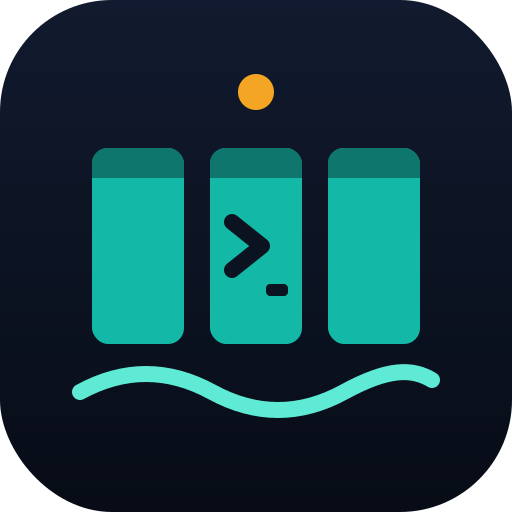
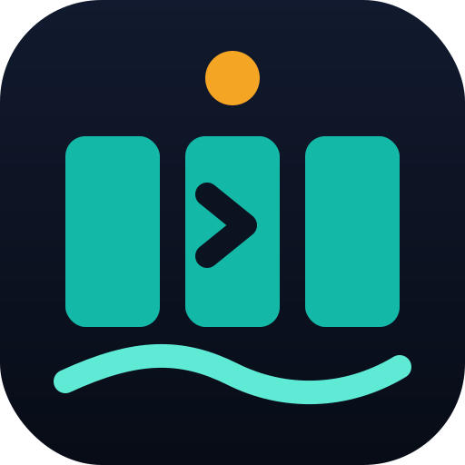
The mark reads as three terminal columns docked in a rounded
harbor tile, an amber beacon above them, a teal prompt caret
mid-column, and a tide line underneath.
Beacon — the amber circle. Attention: a waiting agent, a finding, a completed run.
Three docked columns — teal rounded bars, each with a darker teal header strip, standing in for docked terminal sessions.
Prompt caret — the chevron in the middle column: an agent ready for input.
Water line — the wavy tide-300 stroke beneath the tile: quiet motion, always present.
Harbor tile — the rounded-square container (corner radius ≈ 22% of tile size) every mark and glyph variant shares.
Clear space & minimum size
Keep clear space on every side of the mark equal to 2×
the beacon's diameter at whatever size it's placed.
Never crop, crowd, or overlap the clear space with text or other
UI chrome.
16px — small mark only (favicon, tray icon). Use termbay-mark-small.svg.
24px — standard mark (toolbar, nav). Use termbay-mark.svg.
96px — minimum for the full lockup (mark + wordmark). Below that, use the mark alone.
Variants
Lockup — on dark
Lockup — on light
Stacked — on dark
Wordmark only — on dark
Glyph — color
Glyph — mono light
Glyph — mono dark
Misuse
Real mark, deliberately misapplied — for illustration only.
Don't stretch or distort proportions
Don't recolor outside brand palette
Don't rotate the mark
Don't add drop shadows, bevels, or outlines
Don't place on busy or low-contrast backgrounds
Color
Every color in the product traces back to a token in brand/tokens.json — never a one-off hex value in a component.
#070C16
--harbor-950
rgb(7, 12, 22) · hsl(220, 52%, 6%)
Deepest background — raised surfaces, code blocks
#0B1220
--harbor-900
rgb(11, 18, 32) · hsl(220, 49%, 8%)
App background (dark theme default)
#111A2E
--harbor-800
rgb(17, 26, 46) · hsl(221, 46%, 12%)
Surface — cards, panels (dark)
#1B2740
--harbor-700
rgb(27, 39, 64) · hsl(221, 41%, 18%)
Borders (dark)
#2A3957
--harbor-600
rgb(42, 57, 87) · hsl(220, 35%, 25%)
Strong borders, dividers (dark)
#8A97B0
--slate-400
rgb(138, 151, 176) · hsl(219, 19%, 62%)
Muted / secondary text
#C9D2E3
--slate-200
rgb(201, 210, 227) · hsl(219, 32%, 84%)
Secondary body text (dark)
#F2F8F7
--foam-50
rgb(242, 248, 247) · hsl(170, 30%, 96%)
Primary text (dark) / page background (light)
#E3F1EE
--foam-100
rgb(227, 241, 238) · hsl(167, 33%, 92%)
Surface tint (light theme)
#5EEAD4
--tide-300
rgb(94, 234, 212) · hsl(171, 77%, 64%)
Primary — strong / links on dark
#14B8A6
--tide-500
rgb(20, 184, 166) · hsl(173, 80%, 40%)
Primary — the tide, main brand color
#0F766E
--tide-700
rgb(15, 118, 110) · hsl(175, 77%, 26%)
Primary (light theme), gradient base
#FCD34D
--beacon-300
rgb(252, 211, 77) · hsl(46, 97%, 65%)
Accent — strong, hover states
#F5A524
--beacon-500
rgb(245, 165, 36) · hsl(37, 91%, 55%)
Accent — the beacon, sparingly
#B45309
--beacon-700
rgb(180, 83, 9) · hsl(26, 90%, 37%)
Accent (light theme)
#F43F5E
--signal-red
rgb(244, 63, 94) · hsl(350, 89%, 60%)
Danger, destructive actions, alert Buoy
#22C55E
--signal-green
rgb(34, 197, 94) · hsl(142, 71%, 45%)
Success, connected states
Semantic roles
bg→ harbor-900
surface→ harbor-800
border→ harbor-700
text→ foam-50
text-muted→ slate-400
primary→ tide-500
accent→ beacon-500
danger→ signal-red
success→ signal-green
Provider palette
claude-code#D97757
codex#10A37F
gemini-cli#4E8CF7
opencode#A78BFA
aider#22C55E
cursor-agent#E5E7EB
copilot-cli#8B5CF6
amp#F43F5E
custom#8A97B0
Contrast (WCAG 2.1)
Computed from actual token values — not estimated.
Pair
Ratio
Normal text
Large text / UI
AaBody text on dark background
17.43:1
AAA
AAA
AaSecondary text on dark surface
11.40:1
AAA
AAA
AaMuted text on dark background
6.36:1
AA
AAA
AaPrimary-strong on dark background
12.66:1
AAA
AAA
AaAccent on dark background
9.17:1
AAA
AAA
AaDanger on dark background
5.10:1
AA
AAA
AaSuccess on dark background
8.22:1
AAA
AAA
AaPrimary button label
7.68:1
AAA
AAA
AaBody text on light background
17.43:1
AAA
AAA
AaPrimary on light background
5.09:1
AA
AAA
AaSecondary text on white surface
14.88:1
AAA
AAA
AaAccent on light background
4.67:1
AA
AAA
Typography
Display
Space Grotesk
Headlines, the wordmark, section titles. Weights 500/600/700.
Body / UI
Inter
Body copy, UI labels, buttons. Weights 400/500/600.
Code / mono
JetBrains Mono
Terminal output, code, the eyebrow labels, keyboard shortcuts.
Type scale
Aa 64
Aa 44
Aa 28
Aa 18 — lead paragraph
Aa 16 — body text
Aa 13.6 — mono / code
Pairing rules
Space Grotesk for headings only — never body copy, never longer than ~8 words on a line.
Inter for everything a user reads at length: paragraphs, form labels, table cells.
JetBrains Mono for anything that is, or resembles, literal output: file paths, flags, keyboard keys, terminal text.
Iconography
UI icons come from Lucide,
drawn at a consistent 1.5px stroke (2px is
acceptable at 16px and below, where 1.5px under-renders). Never
mix filled and outline icons in the same view.
16px
20px
24px
32px
Layout & spacing
Spacing is a 4/8/12/16/24 base scale; radii are 6/10/16/22.
4px
8px
12px
16px
24px
6px
10px
16px
22px
UI components
A few core primitives, rendered live with brand tokens.
Buttons
Pills / status chips
Claude CodeConnectedDisconnected
Column header
codex · feature/grid-resize62% ctx
Context meter
Status bar
Termbay v0.9.0•3 projects•6 columns live
Mascot — Buoy
Buoy is the small companion that lives on every column, reflecting
what its agent is actually doing. Buoy never speaks for the agent
and never invents status — its state is driven by real Claude
Code hook events, or a per-provider output heuristic for every
other CLI. Personality: quiet, competent, a little nautical —
never cutesy commentary, never an "AI assistant" voice of its
own.
Idle
When: Column is quiet, no active turn
Don't use for a column that's actually mid-task.
Thinking
When: The agent is reasoning before it acts
Don't hold this state past the first token of output.
Don't confuse with Thinking — Working implies visible progress.
Waiting
When: Needs input or a permission decision
Don't use for a column that's simply idle.
Alert
When: An error occurred or a finding needs attention
Don't overuse for routine warnings — reserve it.
Sleeping
When: It's been quiet in this column for a while
Don't apply immediately on idle — give it a grace period.
Disconnected
When: The CLI process exited or the PTY link dropped
Don't reuse for a column that was deliberately killed by the user.
Illustration style
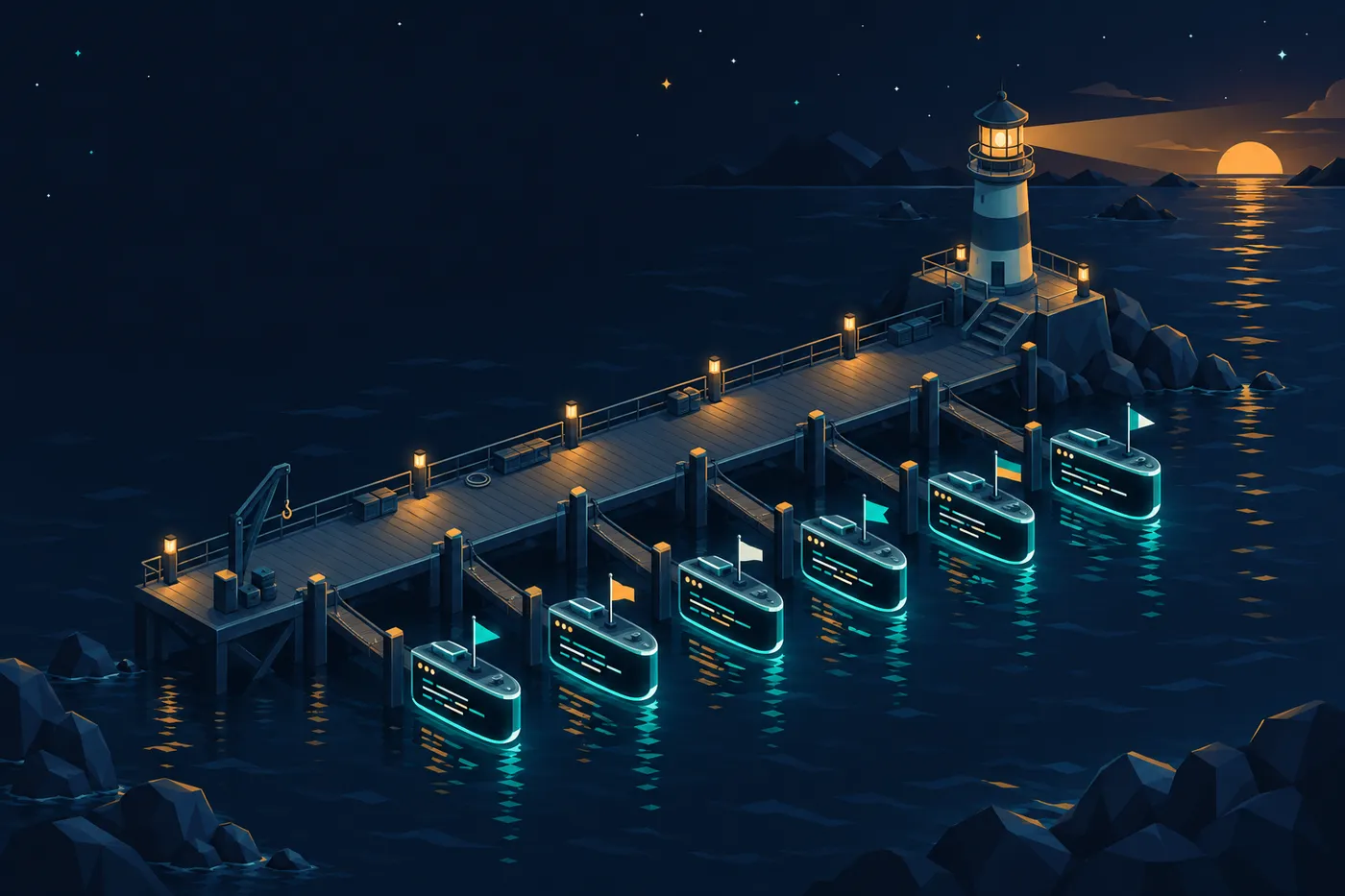
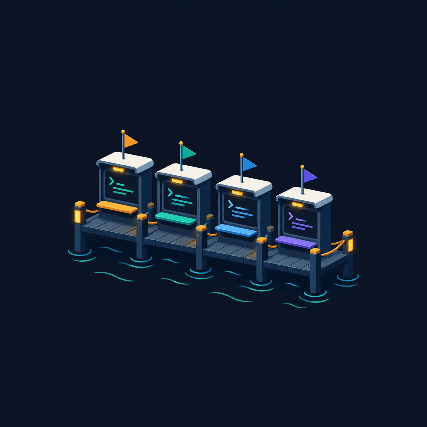
Feature illustrations are flat-isometric, palette-locked to the
harbor tokens, and text-free — the illustration sets the scene,
copy carries the message.
Prompt style guide
The recipe used for every illustration in this system:
Flat isometric illustration, harbor / dock theme, [subject].
Palette strictly limited to: harbor-900 #0B1220, harbor-800 #111A2E,
tide-500 #14B8A6, tide-300 #5EEAD4, beacon-500 #F5A524, foam-50 #F2F8F7.
Soft ambient lighting, subtle grain, no text or lettering anywhere in
the image, no logos, generous negative space for copy overlay,
rounded geometric shapes matching a 16–22px corner radius language.
Screenshot guidance
Every screenshot used publicly is captured from Termbay's own
scripted demo mode (termbay --demo), never a real
user's session. Always frame screenshots in the standard
three-dot window chrome (see UI
components), capture at 1600×1000 for feature shots and
2400×1500 for the hero, and prefer the dark theme unless the
shot's purpose is specifically to show theming.
Motion
Motion is restrained — a "quiet tide," not a bouncy mascot show.
Buoy bob — a 2.4s ease-in-out vertical drift of ±3px, looping, paused entirely under prefers-reduced-motion.
Hover / press — 150ms ease for color and shadow changes; a 1px translateY on press, never a bounce or overshoot.
Panel transitions — 200–250ms ease-out; nothing in the product animates longer than 300ms.
Social & OG templates
The default Open Graph image (1200×630) composites the
og-bg illustration with the on-dark lockup and the
tagline, rendered with outlined font paths so it never depends on
a system font being present on the sharing platform's renderer.
Downloads
Everything on this page, packaged — or grab individual files.










Social & OG templates
The default Open Graph image (1200×630) composites the
og-bgillustration with the on-dark lockup and the tagline, rendered with outlined font paths so it never depends on a system font being present on the sharing platform's renderer.